Taking Stock 2 TEST VERSIONPosted by Sheila in Archive tagged with Brochures / Education / Graphic Design / Literature / Print On Nov 01 2012 This is the second […] Read More...0Celebrating in stylePosted by Sheila in Archive tagged with Brochures / Corporate Identity / Photography On Jul 24 2012150 years of educational excellence […] Read More...0Aspiring homes for StaffordshirePosted by Sheila in Archive tagged with Advertising / Brochures / Corporate Identity On Apr 11 2012Aspire Housing part of the Aspire […] Read More...0Beautiful StaffordshirePosted by Sheila in Archive tagged with Brochures / Corporate Identity On Mar 26 2012 This year, Jackson Hammond […] Read More...0Great support for local schoolsPosted by Sheila in Archive tagged with Branding / Brochures On Mar 26 2012Stoke on Trent City Council […] Read More...01234Next Categories Archive Inspiration Work
Taking Stock 2 TEST VERSIONPosted by Sheila in Archive tagged with Brochures / Education / Graphic Design / Literature / Print On Nov 01 2012 This is the second […] Read More...0
Celebrating in stylePosted by Sheila in Archive tagged with Brochures / Corporate Identity / Photography On Jul 24 2012150 years of educational excellence […] Read More...0
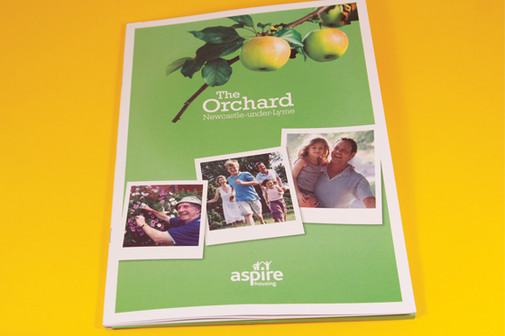
Aspiring homes for StaffordshirePosted by Sheila in Archive tagged with Advertising / Brochures / Corporate Identity On Apr 11 2012Aspire Housing part of the Aspire […] Read More...0
Beautiful StaffordshirePosted by Sheila in Archive tagged with Brochures / Corporate Identity On Mar 26 2012 This year, Jackson Hammond […] Read More...0
Great support for local schoolsPosted by Sheila in Archive tagged with Branding / Brochures On Mar 26 2012Stoke on Trent City Council […] Read More...0